

Book designer spotlight: Mark Campbell
Mark Campbell got his break in the book industry at Hardie Grant Books, where he worked in marketing before moving over to design. He is currently head of design at HarperCollins ANZ and president of the Australian Book Designers Association. ‘It’s a very small, insular network so sometimes you need to be creative about how you even get yourself in the door,’ he says. He spoke to Books+Publishing for our new ‘book designer spotlight’ series.
How did you get into book design and where have you worked?
I got my break when I took on the design manager role at Hardie Grant Books back in 2014, which I did, and loved, for three years. Before that I worked for interview journal Dumbo Feather on all things business related, before accepting a role in marketing at HGB and a leg-up into the publishing industry in general. It’s a very small, insular network so sometimes you need to be creative about how you even get yourself in the door, and hope that the right person interviews you and sees the potential, and the passion, that you have for books. Roxy Ryan was my champion in the very beginning, and I’ll forever be grateful that she took a chance on me.
Currently I work at HarperCollins Publishers where I am the head of design for ANZ. It’s at times a challenging role and an incredibly broad remit—book designs across all genres, marketing and corporate brand design, etc—but I have an incredibly engaged and talented team, and the full support of the company, so I couldn’t imagine working anywhere else.
Which of your book designs are you most proud of, and why?
I have a bunch from my time at Hardie Grant Books—A Year of Practiculture, The Tivoli Road Baker, Chefs Eat Toasties Too, Kenko Kitchen—and am collecting some more from my recent HarperCollins period—The Van Apfel Girls Are Gone, The Erratics, Celeste Barber: Challenge Accepted!, Defeating the Ministers of Death—but I’m most proud of all those I have art directed over the years, working with the industry’s best designers on covers that have defined genres and won critical acclaim. I’m by no means a great designer, but I do feel incredibly lucky to work with many who are.
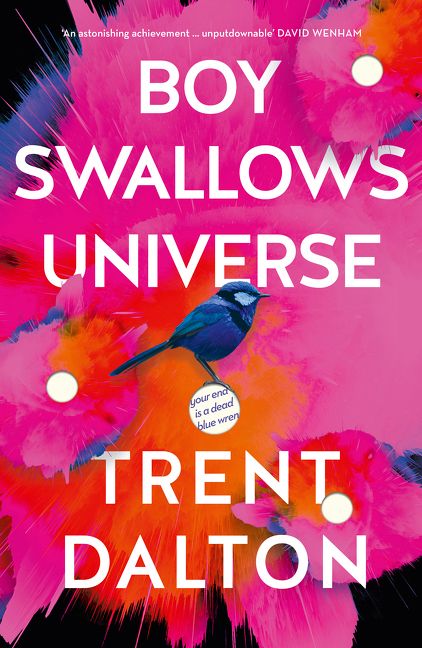
What’s your favourite book cover from the past few years? Why do you think this cover works so well?
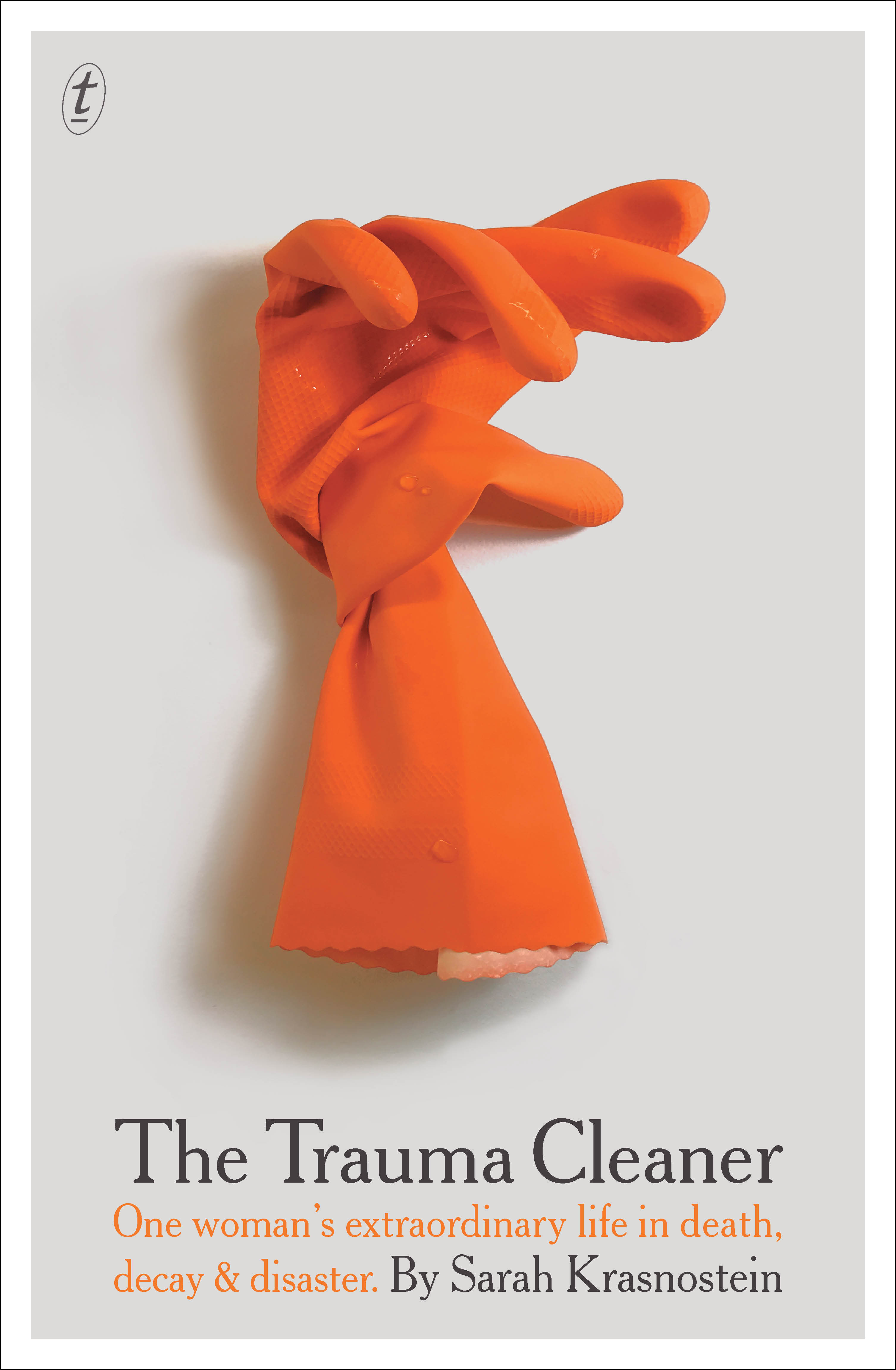
I have three, because I hate playing favourites and I always err on the side of diplomacy: The Trauma Cleaner, designed by W H Chong (Text), Boy Swallows Universe, designed by Darren Holt (HarperCollins) and The Lost Flowers of Alice Hart, designed by Hazel Lam (HarperCollins). I love them all for the same reasons: they’re simple, clever, eye-catching designs that have all spawned a series of knock-offs, but most importantly they balance being beautiful pieces of design while also having clear commercial appeal to a wide audience. Plus, they all look great at thumbnail size, which is crucial to any digital format sales.

Which book design elements do you think are currently being overused? And what would you like to see more of?
Women in coats running into fog/abstract painted blobs or shapes/type sitting half over an image and half off. Ultimately, I like to be surprised by a design … something I’ve not seen before that excites and delights me, and moves the conversation forward. I’d like to see more of that.
Is there such a thing as an Australian book design aesthetic?
Not any more, no. We perhaps err on the side of safe design in Australia, due to the market size and the subsequent demands of costings and margins, but the world is so small, and the design world even smaller thanks to Instagram in particular, so you can easily see what any publisher or designer is creating anywhere in the world at your fingertips. I think we have a ‘world book-design aesthetic’ instead.
Category: Features