Book designer spotlight: Peter Long
Peter Long worked as a designer in theatre and film before moving across to the book industry, where he has worked as a freelancer for most of his career, aside from a five-year stint at Black Inc. Books. ‘It’s often hard to tell if you’re making a difference, but I know that I buy books I like the look of so I assume that other people do too,’ he says. He spoke to Books+Publishing for our ‘book designer spotlight’ series.
How did you get into book design and where have you worked?
Originally I worked in theatre and film, designing posters for theatre shows and also doing set design, production design and even a little bit of costume design. I also did some writing and directing for film. So I was doing a lot of different jobs and sort of making it up as I went along. I started to get a few book design jobs about 20 years ago and it slowly took over. Aside from being senior designer at Black Inc. Books for around five years, I’ve always been freelance.
Which of your book designs are you most proud of—and why?
It’s often hard to tell if you’re making a difference, but I know that I buy books I like the look of so I assume that other people do too. I think Girt by David Hunt (Black Inc.) was one of the rare cases where the cover pretty clearly helped make the book a success—I think it hit the tone of historical absurdity that was there in the writing with a simple image. After Girt came out, there were a few copycat covers, which is a good sign that a design has nailed it.
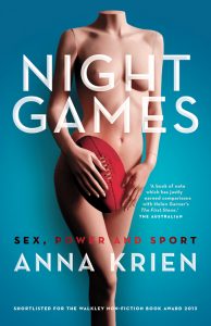
Night Games by Anna Krien (Black Inc.) is a really odd cover that popped into my head after weeks of doing predictable roughs and getting nowhere, and it was brave for the publisher to go with it. Its strangeness made it compelling and memorable.
The People vs the Banks (Michael Roddan, MUP) is a recent cover that works pretty well. The title does all the work identifying it as a business book, so there is room for an unlikely colour and a bit of humour. Business books don’t need to be dull and dry.
I worked on a documentary once where we interviewed John Malkovich, and he said sometimes you have a great time making a film and it sinks without a trace, and sometimes the shoot can be an unhappy experience but the film winds up working for some reason. It’s the same with book covers I think, sometimes I am fond of covers because I had fun making them even if they haven’t set the world on fire.


What’s your favourite book cover from the past few years? Why do you think this cover works so well?
 In that same vein of weird and compelling, W H Chong’s cover for A Girl is a Half-Formed Thing (Eimear McBride, Text) gets my vote for best Australian cover of the last few years. It’s so right because it’s so wrong—compellingly out of whack with everything else on the shelves, but actually really appropriate for the style of writing.
Which book design elements do you think are currently being overused? And what would you like to see more of?
We expect in the supermarket that plain chips will be in a blue bag and salt and vinegar will be pinky-purple (why?!?) and it’s the same with books—with most publishing you need to press the appropriate genre buttons. But within that there’s still space for some difference and playfulness. Marketing is all about trying to match products to audiences based on what has sold before, but I think at the more literary and intelligent end of the market punters are actually yearning for something new and original. It does require bravery to take that leap, especially in a small market like Australia, but it’s such a zing when you see something you haven’t seen before.
Is there such a thing as an Australian book design aesthetic?
I don’t think so. It’s a very globalised industry and everyone knows what everyone else is doing pretty much instantaneously.
Category: Features


