

Book designer spotlight: Andy Warren
Andy Warren began his career at Hardie Grant before moving exclusively into children’s books at Five Mile. His recent designs include an award-winning range of publications celebrating Barbie’s 60th birthday. He spoke to Books+Publishing for our ‘book designer spotlight’ series.
How did you get into book design and where have you worked?
I got into book design after completing a degree in Communication Design at RMIT. After I graduated, I got in touch with Hardie Grant and scored an internship. Following on from there I worked casually in-house on marketing and then eventually I began working on books full-time. I worked in-house at Hardie Grant Books for around three years and I’m now working on children’s books full-time with the wonderful team at Five Mile. We’re a small team working on a very exciting list and I’m so happy to be a part of it.
Which of your book designs are you most proud of—and why?
Each book that I’ve worked on feels a bit special so it’s quite hard to choose between them. I have recently designed a special range of publications celebrating Barbie’s 60th birthday. It was a really fun brief and I’m particularly proud of the unique spin I was able to place on such an iconic character with the team at Five Mile. A bonus was when this range won best in show at the global Mattel conference, which gave us such a nice buzz.

Another project that I’m very proud of is A Tree in the House by Annabelle Hickson (Hardie Grant). I’m proud of this book because it felt like the design really spoke to the content, which is what I’m always aiming for.

What’s your favourite book cover from the past few years? Why do you think this cover works so well?
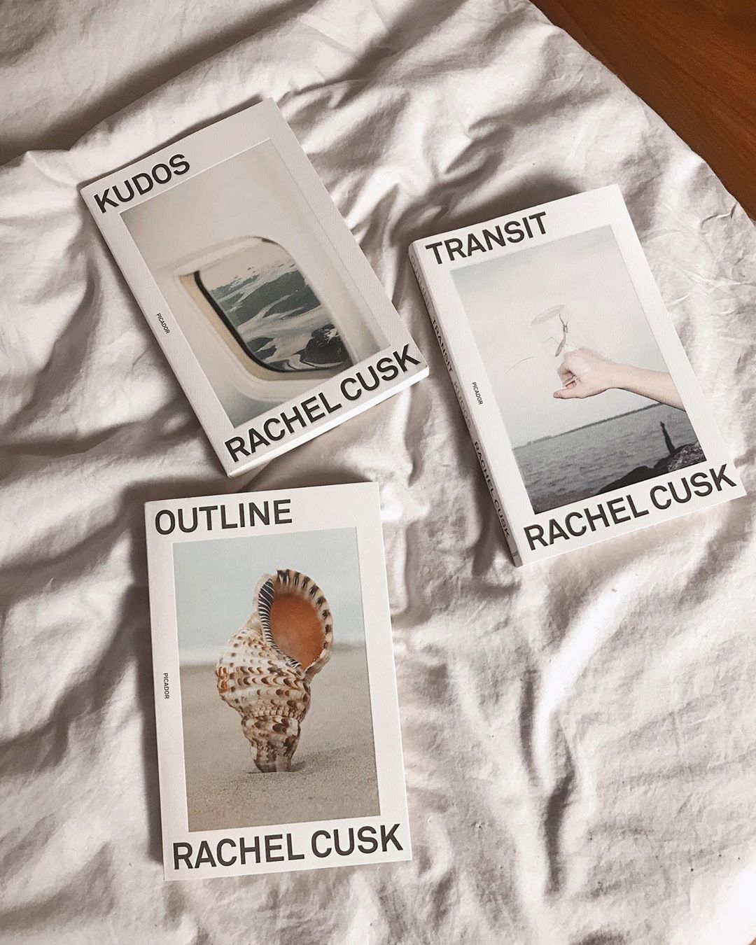
I really loved the cover for The Pisces by Melissa Broder, designed by Rachel Willey (Bloomsbury). It’s a bit quirky, which is probably why it stands out to me so much. When I break it down it really has the perfect marriage of type, image and colour palette. A special mention to the Outline trilogy by Rachel Cusk, designed by Rodrigo Corral, which I’ve only discovered recently but can’t stop looking at. The covers really speak to the Instagram aesthetic with the palette, restrained type and overall cleanliness of the package.

Which book design elements do you think are currently being overused? And what would you like to see more of?
I have noticed a lot of scientific flora and fauna illustrations in the last couple of years. This makes sense as there seems to be a trend of returning to nature. I really love the look, but it is starting to reach saturation point. I’d really like to see some bolder choices in fonts, particularly in the nonfiction categories, where we’re seeing a lot of Brandon Grotesque. It is starting to feel like a default or safe option.
Is there such a thing as an Australian book design aesthetic?
I believe so. There seems to be a pretty diverse spectrum of book design in Australia so it’s hard to define it. I would say the Australian book design aesthetic generally straddles commercial and arty quite well where other markets tend to lean towards one or the other.
Category: Features