
Book designer spotlight: Sarah Davis
After working for over a decade as a freelance picture book illustrator and designer, Sarah Davies joined Walker Books Australia as associate art director. She spoke to Books+Publishing for our ‘book designer spotlight’ series.
How did you get into book design and where have you worked?
I started out in book design working for a book-packaging company that made novelty trade books—dodgy aesthetics, very high turnover, high pressure, lots of die cuts, pop-ups, sparkles and novelty effects, working in some ancient version of Quark! Then a job as art director for a print-on-demand company that produced personalised children’s books in association with sports stars, which was surreal. After that I spent over a decade freelancing as a picture book illustrator and designer.
I’m now associate art director at Walker Books Australia, which is a dream job that combines all my first loves—illustration, visual narrative, problem-solving, creating beautiful things, and working with extraordinarily talented people. Working at a house where the editorial and design teams drive acquisitions and have a lot of autonomy is a luxury. We specialise in picture-book-making, which is a delicate and tricky business—it’s a long process that requires sensitive collaboration between the publishing house, the author and the illustrator.
Walker has a tradition of in-house designers who are themselves also artists, illustrators and writers, which lends an extra dimension to the development process. Often picture-book illustrators will only ever get editorial feedback rather than art direction, and the design is freelanced out-of-house, which is a totally different experience to working closely with someone who has hands-on experience of the illustration process and speaks the language of visual art.
Which of your book designs are you most proud of—and why?
I tend to do things and move on, and then get excited about the next thing. Upcoming books that I’m looking forward to seeing out in the world are Mika and Max by Laura Bloom—for the cover image I created a paper diorama world, which was a lot of fun—and The Book of Stone, written by Mark Greenwood and illustrated by Coral Tulloch (November). The cover uses some of Coral’s glorious stony textures to create a slab effect, which is debossed and engraved, and it’s going to look really cool.


What’s your favourite book cover from the past few years? Why do you think this cover works so well?
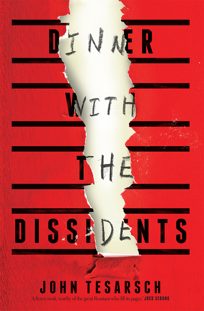 That’s really hard—there’s so much incredible talent out there! I actually really liked the cover for Dinner with the Dissidents (John Tesarsch, Affirm), designed by Josh Durham, which ended up winning Best Designed Commercial Fiction Cover at the ABDA awards this year. I like bold covers that play with surface and texture, clever typography, and images that provoke some kind of visceral response, and this has all of those elements.
Which book design elements do you think are currently being overused? And what would you like to see more of?
I’m not a fan of the whole ‘Big Book’ treatment—if I see one more book with big white sans serif type spaced down the cover and intertwined with bits of hair or birds or foliage … I think it’s interesting to see how book cover design has changed in order to make an impact on social media. It’s a rather cool example of how design evolves and adapts to shifts in the market, but it has resulted in some overdone tropes.
As an illustrator myself, I would say that what we need more of is—illustration! I think we should support the illustration industry and help it thrive, and in a world of stock imagery appreciate the unique touch that the right illustrator can bring to a project.
Is there such a thing as an Australian book design aesthetic?
I don’t really think so … everyone needs to be so globally focused nowadays. We do have an awful lot of talent in Australia, though.
Category: Features