
Book designer spotlight: Hannah Janzen
Hannah Janzen began designing books at Sydney design studio Xou Creative, before turning to freelance, specialising in children’s books. She was recently elected president of the Australian Book Designers Association (ABDA). Janzen spoke to Books+Publishing for our ‘book designer spotlight’ series.
How did you get into book design and where have you worked?
My first job out of design school was for a design studio—Xou Creative in Surry Hills. At Xou I worked on a range of projects including publication design, illustration, visual identity, advertising, packaging and other printed matter, but it was book design that captured my heart. My first week on the job I designed a book cover for St Paul’s Publications and I fell instantly in love with book design! Shortly thereafter, the annual Australian Book Design Awards were held and I was greatly inspired by the passion and creativity shown by the shortlisted and winning designers of that year, and was motivated to become a part of the Australian book design community.
Over the six years I worked at Xou, I was fortunate to work for publishers including Hachette, Hardie Grant, HarperCollins, Little Hare, Pan Macmillan, Scholastic and Simon & Schuster, to name a few. It was wonderful to have the opportunity to design for such a range of publishers and genres, including fiction, nonfiction, illustrated books, cookbooks, textbooks, children’s books and YA, as well as marketing materials.
For the past six years I have worked as a freelance book designer for a number of publishing houses on fiction, nonfiction and illustrated titles, specialising in children’s books.
Which of your book designs are you most proud of—and why?
Every project holds a special place in my heart for all different reasons. A recent favourite was Fox & Bird by Edwina Wyatt, illustrated by Alice Lindstrom (Little Hare). It was such a pleasure to work with such stunning content, which made the narrative between Fox and Bird flow so beautifully.
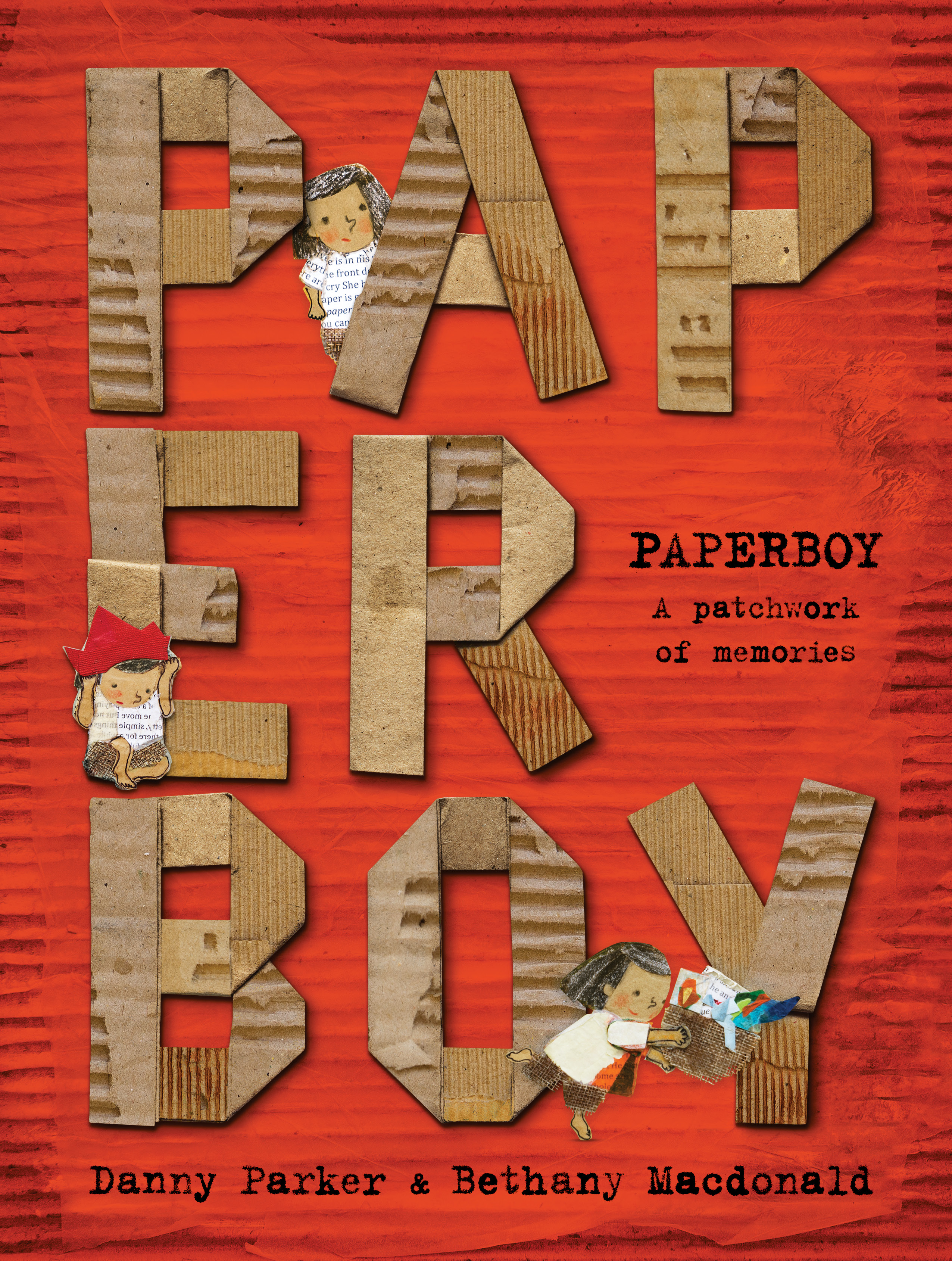
A completely different title but equally as beautiful (and also collaged!), Paperboy by Danny Parker, illustrated by Bethany Macdonald (Dirt Lane Press) presented a creative challenge to capture the essence of the layers of story in the poetic narrative without giving too much away. I love the typographic title treatment, wrapped in Bethany’s collage artwork. The internals are typeset in an amazing typewriter font with eight variations of every letter, which really is a designer’s dream! I chose every letter individually throughout the story, so it really was typeset with love!

What’s your favourite book cover from the past few years? Why do you think this cover works so well?
I am a sucker for a typographic cover, especially one you want to touch! Some of my favourites include David Pearson’s Great Ideas Volume 1 (Penguin) for being completely unexpected in what we usually assume a series design should look like, and the liberal use of embossing on these textured beauties. These thoughtful, handsome covers showcase graphic typography in a limited colour palette that reveal something about the content of each book.

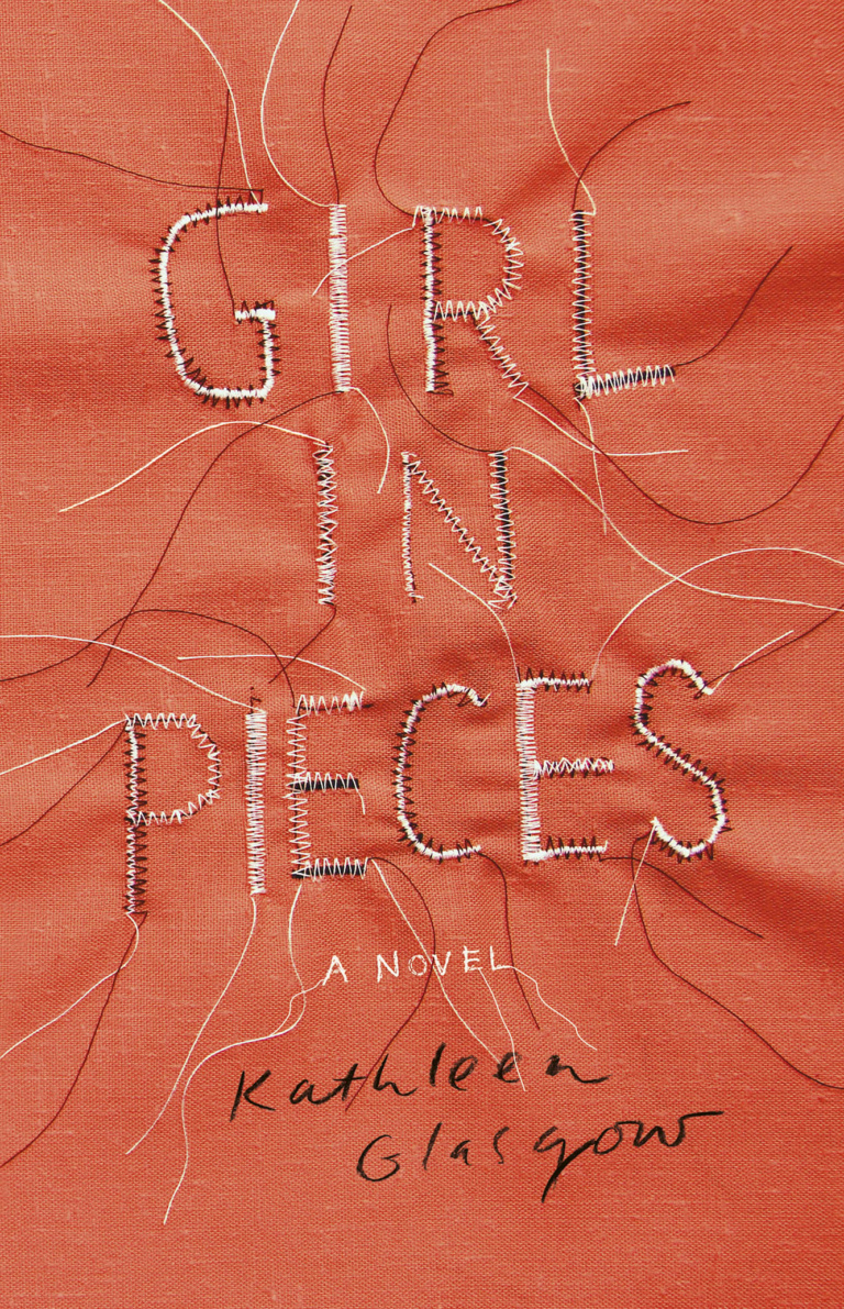
Other favourites are Pearson’s version of Nineteen Eighty-Four (George Orwell, Penguin), with the clever use of matte black foil to obscure the title, and Allison Colpoys’ design for Girl in Pieces (Kathleen Glasgow, HarperCollins). These covers stand out to me for their use of simple, bold design and clever use of typography.

Which book design elements do you think are currently being overused? And what would you like to see more of?
Trends are an interesting thing in publishing as books are scheduled so far in advance. I find it fascinating to see what other books are ultimately displayed in the bookshop alongside the books I’ve worked on. I think it’s expected to see trends emerge based on successful publications. The familiar is comfortable, whether it be millennial pink, botanical flowers, integrating photographic elements to overlap title treatments, crossing out words in the title, mid-century modern illustration or utilising a certain font, but I like to be surprised by design and see something that I haven’t seen before. It’s a critical balance between targeting the market, being commercially viable and leaving enough room for creativity and freshness that really is key.
Is there such a thing as an Australian book design aesthetic?
I don’t know if we have a particular ‘Australian Aesthetic’. In my experience, Australian cover briefs tend to toe a careful line between commercial and literary to appeal to the broadest possible market. As a designer I often hold my breath as I send off the first round of cover concepts to see what will ‘make the cut’ and what might be too bold/scary/different for the market. Perhaps this process of ‘design by committee’ does eventually create a particular aesthetic, or perhaps it is the coming together of a vast array of designers and creators all doing their thing? More and more in this global market we can see what publishers and designers are doing around the world. Here’s to a big, brave, vibrant, creative future!
Category: Features