


Book designer spotlight: Hazel Lam
Hazel Lam began her career as a motion graphics designer before moving into publishing, and has spent the past six years working for HarperCollins. Her cover for The Lost Flowers of Alice Hart was voted the designers’ choice cover of the year at this year’s Australian Book Design Awards. Lam spoke to Books+Publishing for our ‘book designer spotlight’ series.
How did you get into book design and where have you worked?
I actually started out as a motion graphics designer with dreams of becoming a music video director, but ended up in television graphics for a few years, which I really didn’t enjoy. My first taste of books was when I worked with Jay Ryves, creative director of Future Classic, designing party flyers and occasionally helping her typeset cookbooks that she was designing. I loved it but unfortunately I couldn’t find a job in the publishing industry, so I moved to London for a couple of years. I ended up back in Sydney and worked for Delicious magazine for six months before getting my first role as a book designer at HarperCollins, where I am still at six years later.
Which of your book designs are you most proud of—and why?
There are so many books I’ve loved working on, it is ridiculously hard to choose a favourite, but I find my best designs come from the books that I really connect with. Last year, The Lost Flowers of Alice Hart by Holly Ringland is a great example. I absolutely adored the manuscript and I knew Edith Rewa’s beautiful illustrations had to be on the cover. The result is a magical package that I am still very proud of. At the time, it felt super new and bold for a commercial fiction cover. The Power of Hope by Kon Karapanagiotidis is another book I really loved working on. I really admire the work that Kon does as the CEO and founder of the Asylum Seeker Resource Centre and was super excited when I got briefed to work on his book. I really wanted to design a cover that represents his passion, warmth and the importance of his work. I think we ended up with a super-striking cover for a very important book.


What’s your favourite book cover from the past few years? Why do you think this cover works so well?
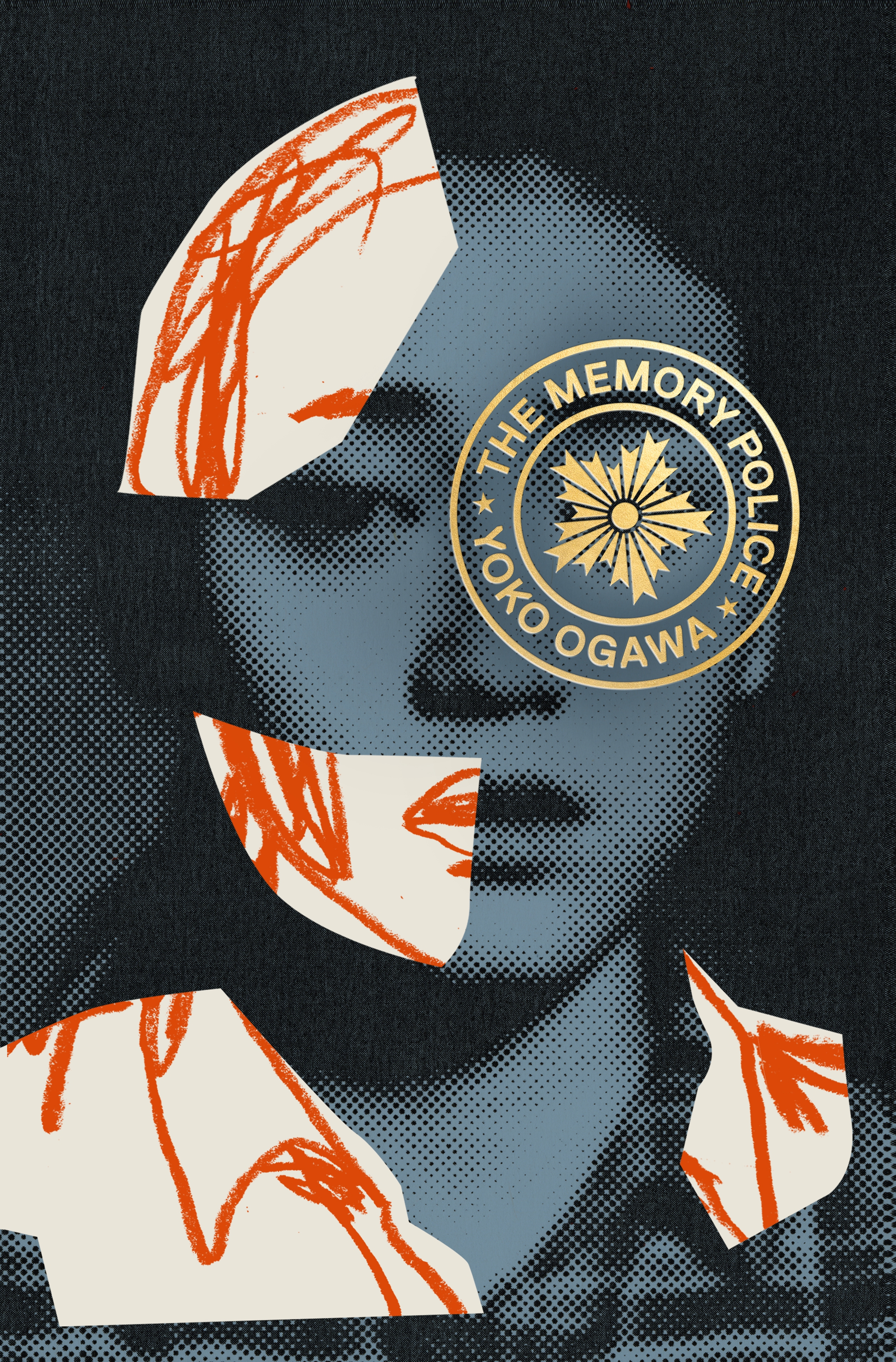
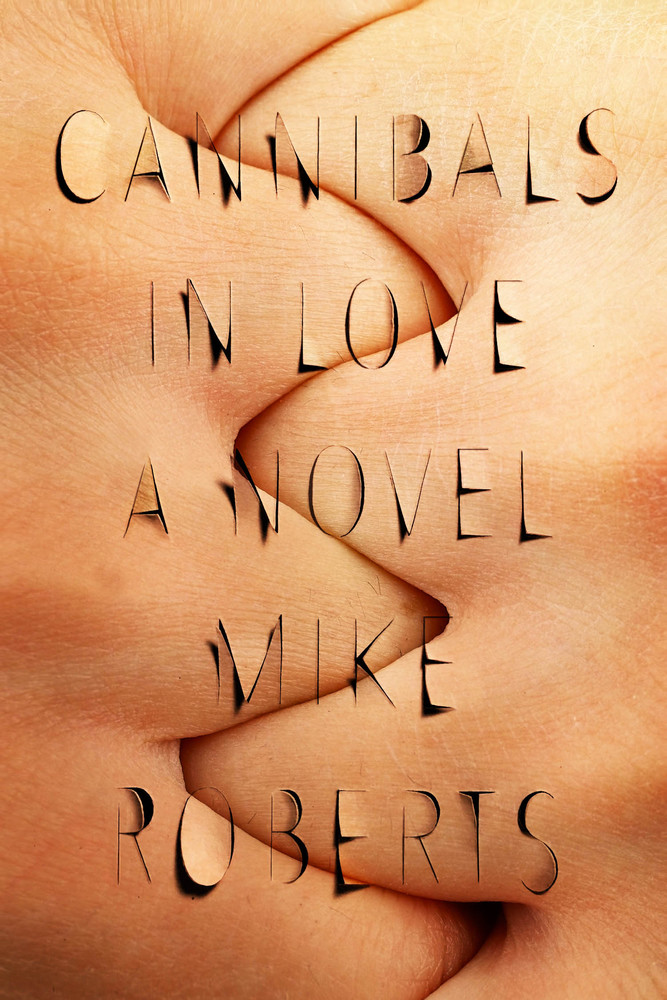
Ahh, there are so many! Recently, one that has caught my eye is The Memory Police by Yoko Ogawa, designed by Tyler Comrie (Harvill Secker). The image is just so striking and the typography is so elegant and simple. The cover is the perfect marriage between the two and the result is a bold and intriguing cover. Cannibals in Love by Mike Roberts, designed by Na Kim (FSG), is another one from a few years ago that really stands out. The design is very clever, the image works so well with the title, and again it is a great example of image and type working together in perfect unison. The cover is uncomfortable and confronting, but also fascinating.
Which book design elements do you think are currently being overused? And what would you like to see more of?
There are a few design elements that I think are being overused. I think there is a strong trend in fictional crime covers where condensed sans serif fonts are coupled with dark landscapes. Another style that is overused are sans serif fonts on coloured backgrounds for nonfiction titles, which have worked so well in the past few years, but I’d like to see more covers with bolder, unexpected font choices and image combinations.
Is there such a thing as an Australian book design aesthetic?
I do think there is an Australian design aesthetic. I think there is a tendency for Australian publishers to follow trends or the design aesthetic of books that have had commercial success. But in saying that, I do think more and more publishers are making bolder choices, and it is getting increasingly difficult to pick Australian designs out from international designs.
Category: Features


