

Book designer spotlight: Michelle Mackintosh
Michelle Mackintosh is a freelance book designer, as well as a writer, illustrator and Japanophile (she’s co-written four books on Japan with her husband, writer and DJ Steve Wide). She spoke to Books+Publishing for our ‘book designer spotlight’ series.
How did you get into book design and where have you worked?
I started my design career in a small design studio as a logo designer who also did all the studio’s illustration. A photographer asked me to design some covers with her images in my spare time. That was with Lothian Books in the early 2000s (under children’s book publisher Helen Chamberlin). I loved the work so much that I left my job, started my own business and began designing books full time. As a huge reader and lover of the written word, I cannot think of a lovelier career than designing books. Over the years I have illustrated six children’s books, co-written four books on Japan with my husband Steve Wide, and written two books of my own. So you see I love all the parts—book design, writing, photography (I sometimes take my own photos and art-direct photographers), illustration …
Which of your book designs are you most proud of—and why?
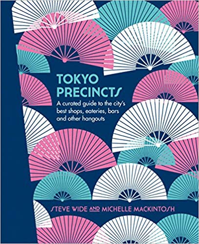
I have two favourite projects. Tokyo, my most recent book co-written with my husband and published by Plum. I’m so proud of Tokyo because I had the freedom to make beautiful patterns (a real passion of mine), take photos and write about my favourite things. The ‘Precincts’ series with Hardie Grant Books is another absolute favourite project, as they each have a bright, poppy graphic cover with collages of images and illustrations internally.

What’s your favourite book cover from the past few years? Why do you think this cover works so well?
I really love Magnus Neilson’s Faviken (Phaidon Books UK). I adore a clever illustrative cover. I love the colours, restraint and naivety of it.
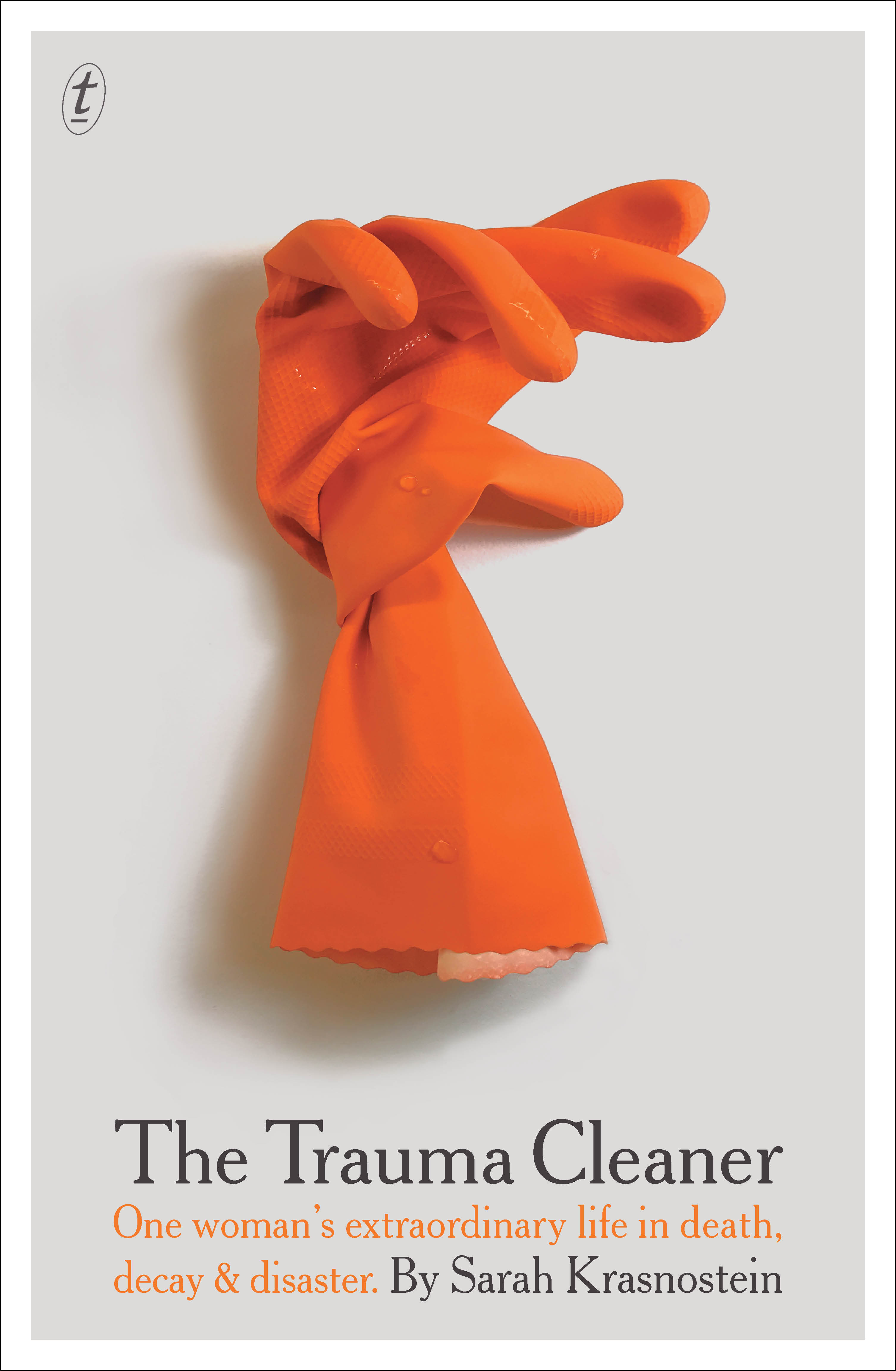
In Australian publishing I absolutely love The Trauma Cleaner by Sarah Krasnostein, designed by W H Chong (Text). This cover is so simple, brilliant and clever.
Peter Gilmore’s From the Earth, designed by Daniel New (Hardie Grant), is an incredible example of timeless beauty. Beci Orpin’s new board books with Hachette are adorable too.


Which book design elements do you think are currently being overused? And what would you like to see more of?
Covers with an inset image, especially with a pastel background, are very popular right now. I’d love to see some more unusual finishes, stocks and cover techniques.
Is there such a thing as an Australian book design aesthetic?
I feel so proud to be part of the Australian book design community. I spend an hour each week in Readings Carlton checking out the book scene. There are so many great designers and publishers who are dedicated to creating innovative, thoughtful covers here in Australia. The combination of publishers who are commissioning important and relevant books, and designers interpreting the brief and pushing boundaries makes for one of the most vibrant design communities in the country. I’m not sure there is an Australian aesthetic apart from quality and innovative work.
Category: Features