

Book designer spotlight: Imogen Stubbs
A love of publishing sparked by the Professional Writing and Editing course at RMIT led to studying graphic design, eventually landing Imogen Stubbs a job at Text Publishing, where she is currently art director. She spoke to Books+Publishing for our ‘book designer spotlight’ series.
How did you get into book design and where have you worked?
Definitely by luck and with some hard work. I was the type of high school student who thought that because I couldn’t draw or paint I couldn’t be arty, so went into a science degree only to quickly realise it wasn’t for me. Instead I spent most of my time making zines, and thankfully a helpful course counselor at RMIT suggested I apply for the Professional Writing and Editing course as it had some layout and desktop publishing subjects. This turned out to be the best thing because it sparked my love of publishing and made me realise it could be a job.
From that course I also met incredible people like Davina Bell and Julia Carlomagno, who, with Rachael Howlett, started Harvest magazine and let me art direct and design each issue. This was a wonderful introduction to many writers and creatives and the publishing process. I also managed to get a job typesetting books at Brolga Publishing, which developed into a production and project management role, and led to me studying graphic design. After that I landed a job at Text Publishing that combined design and production, and from there have worked my way up to art director. I’ve been extremely lucky to work with and be mentored by W H Chong at Text, who has been a real champion of my book design career thus far.
Which of your book designs are you most proud of—and why?
Obviously a hard question but I’m going with my first, a middle and a recent one. The first was Burning Blue by Paul Griffin: I was terrified to do it and had no idea if my concept was any good or not, but it ended up being approved in-house and by the author very quickly. It felt like a dream come true—that I could do this book design thing. It also sparked my love of designing young adult and middle-grade covers.
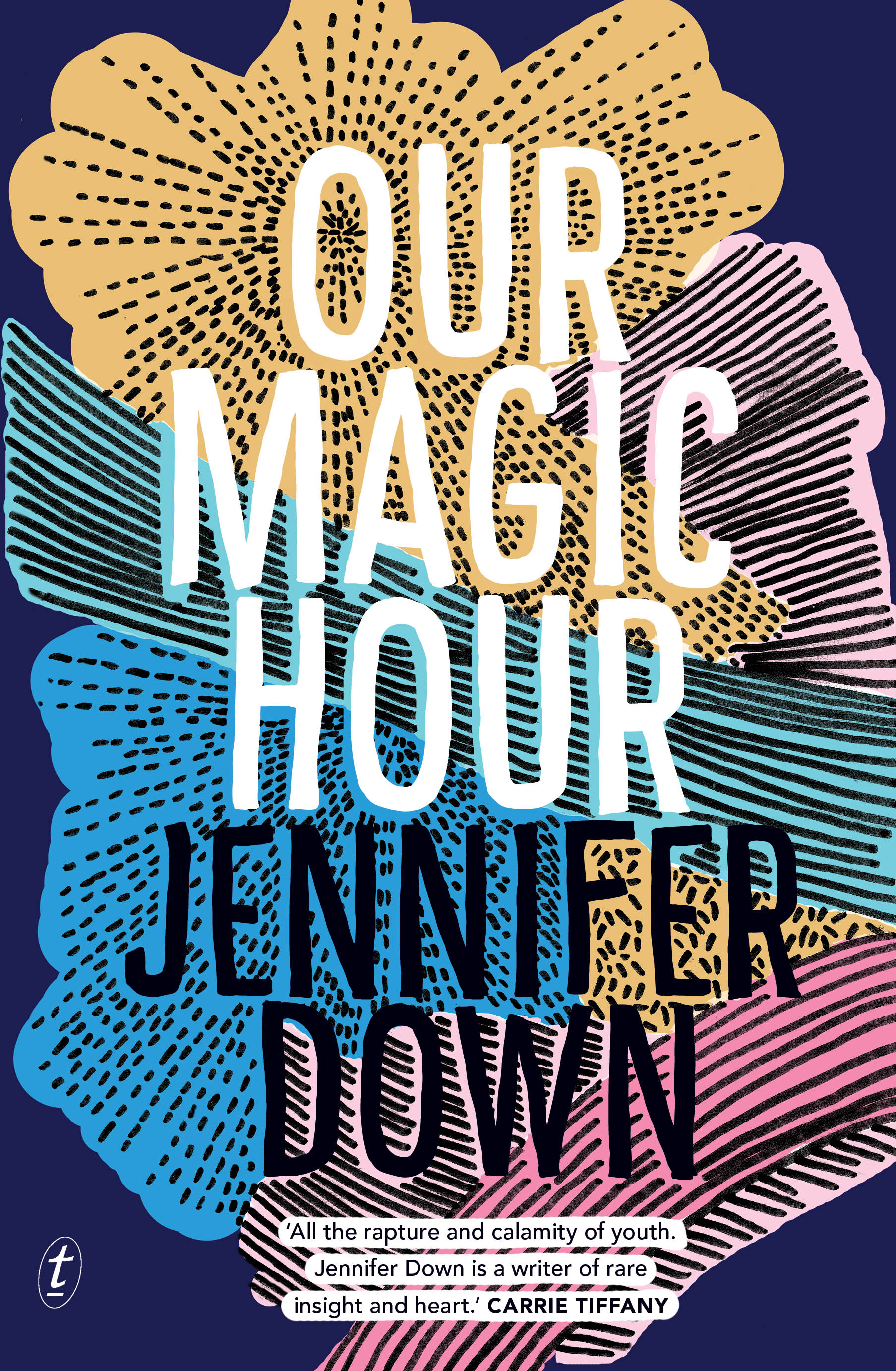
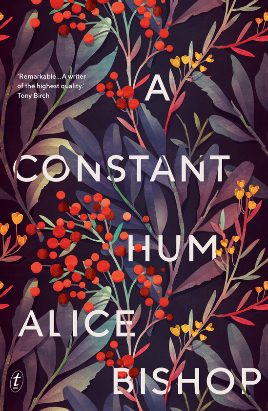
I also have a real soft spot for designing covers for debut authors. It’s an incredible privilege to design an author’s first work. Two particular favourites of mine are Our Magic Hour by Jennifer Down and A Constant Hum by Alice Bishop. I connected with and loved both manuscripts, which led to both designs falling into place quickly, and my concepts were approved by the Text team and authors. It was a real highlight to see the reception those covers got out in the world, and I hope they helped the books find many fans. Jennifer Down’s mum even had mugs printed with the book covers on them!

What’s your favourite book cover from the past few years? Why do you think this cover works so well?
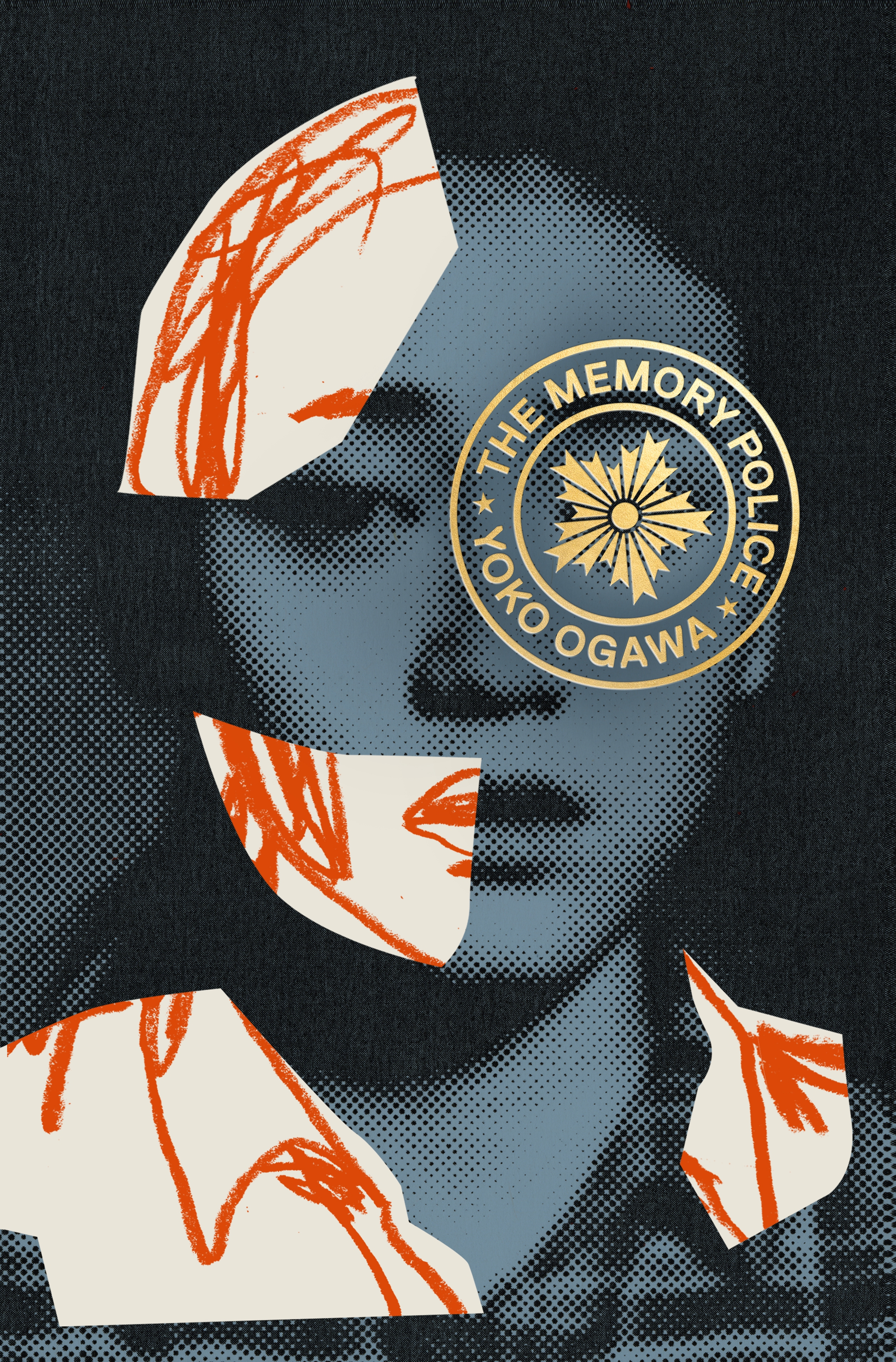
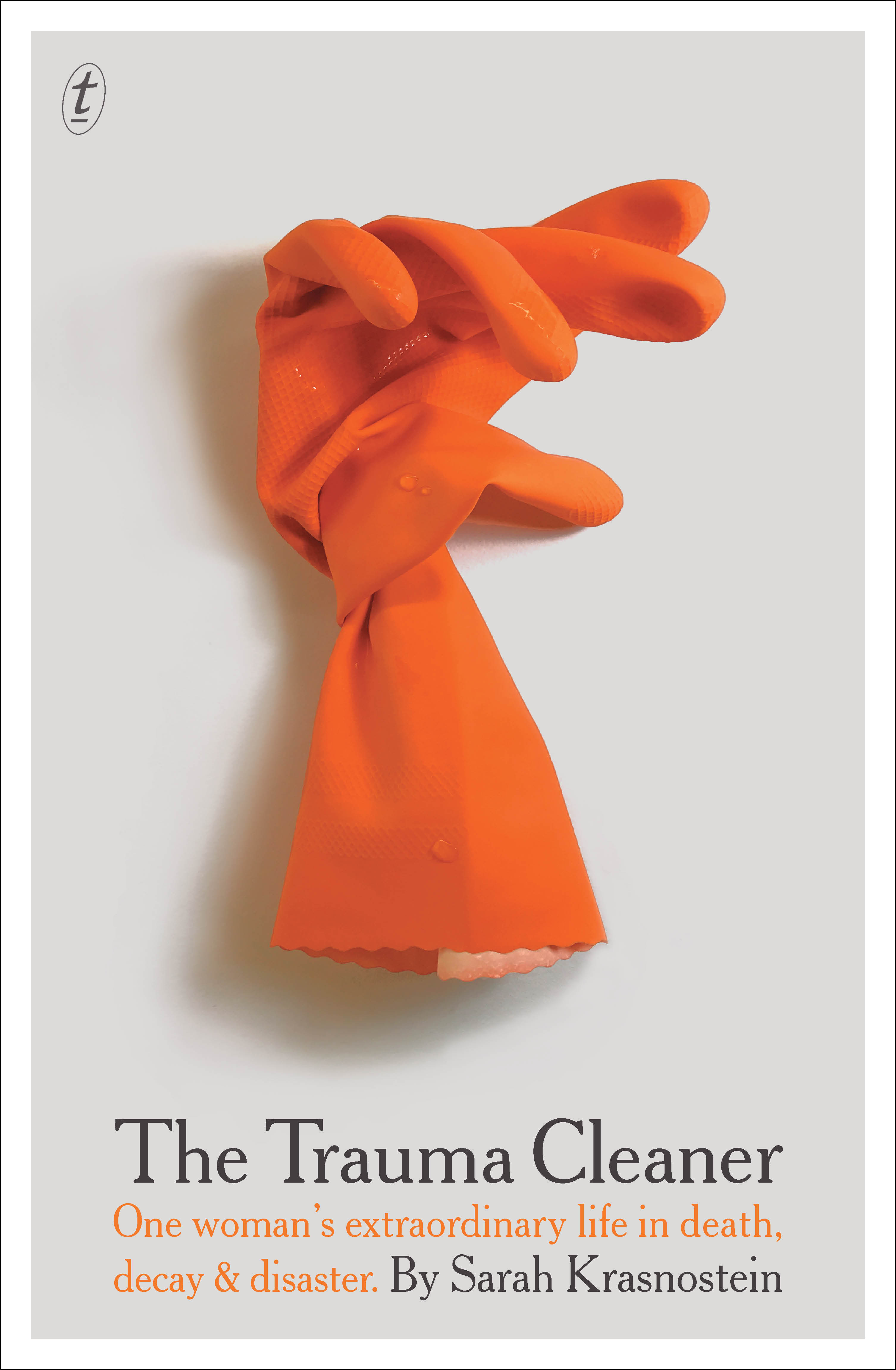
I loved The Memory Police (by Yoko Ogawa, Harvill Secker), designed by Tyler Comrie, as soon as I saw it. It’s not a genre I would normally read but there’s something so striking about the use of photo, illustration and stamp type that is at once fragmented yet cohesive. It really drew me in and I wanted to know more. W H Chong’s design for The Trauma Cleaner (by Sarah Krasnostein, Text) is also a firm favourite, particularly as I was on the inside of the process and know the many iterations it took to get to such a perfect resolution. Now it seems like it could only have ever had that cover.
Which book design elements do you think are currently being overused? And what would you like to see more of?
I would love a break from the big white type trend, but I think, thanks to social media and thumbnail-sized covers for e-retailers, it’s here to stay. At times I think it would be beneficial for two covers to exist—a thumbnail-friendly, maximum-impact online version and a print-appropriate hard-copy one. I’m often drawn to the quiet, restrained and simple covers in shops because everything around them is so busy.
Is there such a thing as an Australian book design aesthetic?
Only in that we have extremely talented designers producing brilliant, authentic and original work. Sometimes I think you can still pick a US cover versus a UK cover, but I think Australian designers do a great job of bridging many markets while also having their own style.
Category: Features